
Ambleside Avengers — Youth Football Club Branding
A vibrant and cohesive branding concept for a Coventry-based children’s football club, developed as part of a university-led team project.
Visual Identity · Print Design · Team Branding
Client: Ambleside Avengers (Coventry)
Project Type: Branding & Marketing Collateral
Timeline: University Project — 2022
Scope: Logo Design · Color Palette · Typography · Posters · Certificates · Brand Guidelines
Tools: Adobe Illustrator · Photoshop · InDesign
Team: University Branding Team (led by Sofija)
During university, The Satary Studio led a team branding project for Ambleside Avengers, a children’s football club based in Coventry. The objective was to develop a comprehensive and cohesive visual identity that captured the energy and team spirit of the young athletes.
Although the branding concept was not ultimately selected by the club, the project achieved second place in the competition — demonstrating strong creative execution, clear strategy, and professional presentation.
This project provided valuable experience in leadership, branding development, and collaborative creative work within a competitive environment.


The branding concept for Ambleside Avengers centered around vibrant green tones, dynamic shapes, and bold typography to reflect the energy and enthusiasm of a youth sports team.
Key deliverables included:
Logo Design: A strong, athletic emblem that represents team unity.
Color Palette: Bright green as the primary color, paired with black and white for contrast and versatility.
Typography: Bold, modern typefaces to ensure visibility and consistency across applications.
Brand Guidelines: A detailed visual guide outlining logo usage, colors, and typography to maintain cohesive application across all materials.
To support the visual identity, a set of marketing and print materials was developed to showcase how the brand could live across various formats:
Poster Design: Featured the team’s logo, vibrant green palette, and a black-and-white portrait at the center — combining key branding elements into a visually impactful layout.
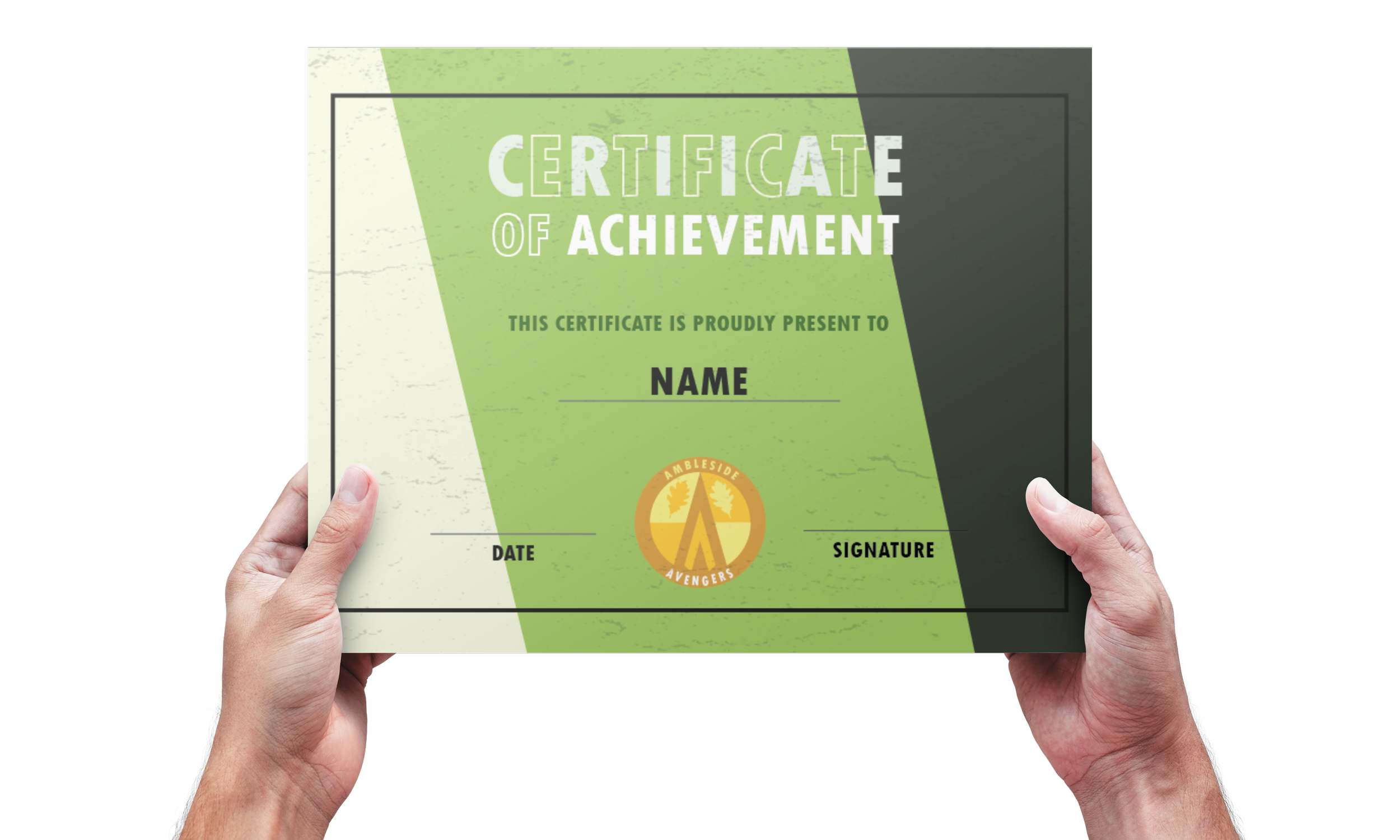
Certificate of Achievement: Celebrated team accomplishments while reinforcing brand identity through consistent design.
Tote Bag: A bold, centered logo design transformed a simple accessory into a branding tool.
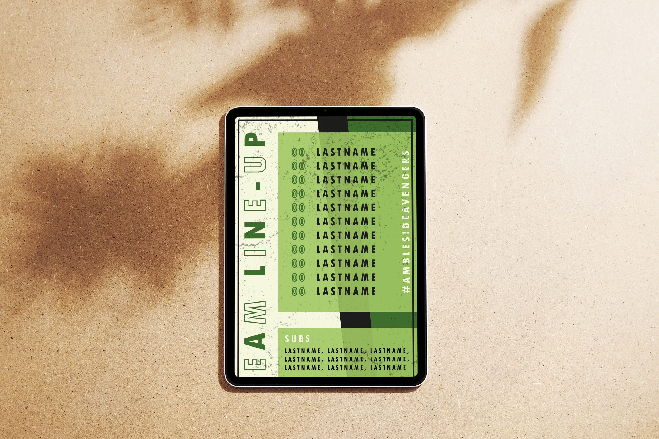
Team Line-Up Page: Presented players in a clean, structured layout aligned with the club’s colors and visual system.
This project was both a creative and strategic exercise, allowing The Satary Studio to explore how branding can unite a team, build identity, and create emotional connection — even for young audiences.
It also reinforced skills in team leadership, concept development, and competitive presentation, providing real-world experience in managing creative direction and delivering cohesive, impactful branding systems.