
Pregnancy Exercise Brochure
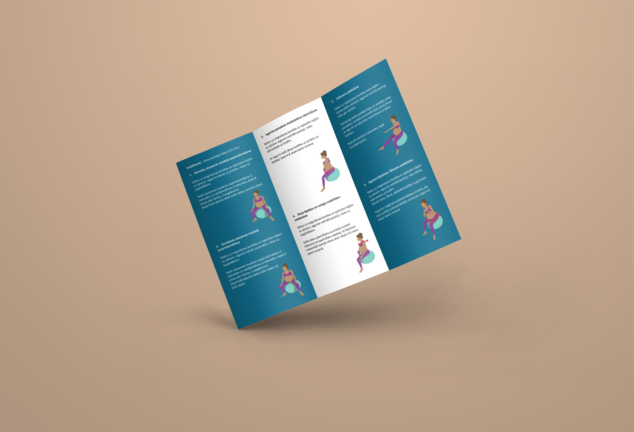
This project was one of my first freelance collaborations, where I designed a brochure featuring pregnancy exercises for a medical student’s university project. The client provided fonts and exercise descriptions, while I created the illustrations and overall layout using Adobe Illustrator.
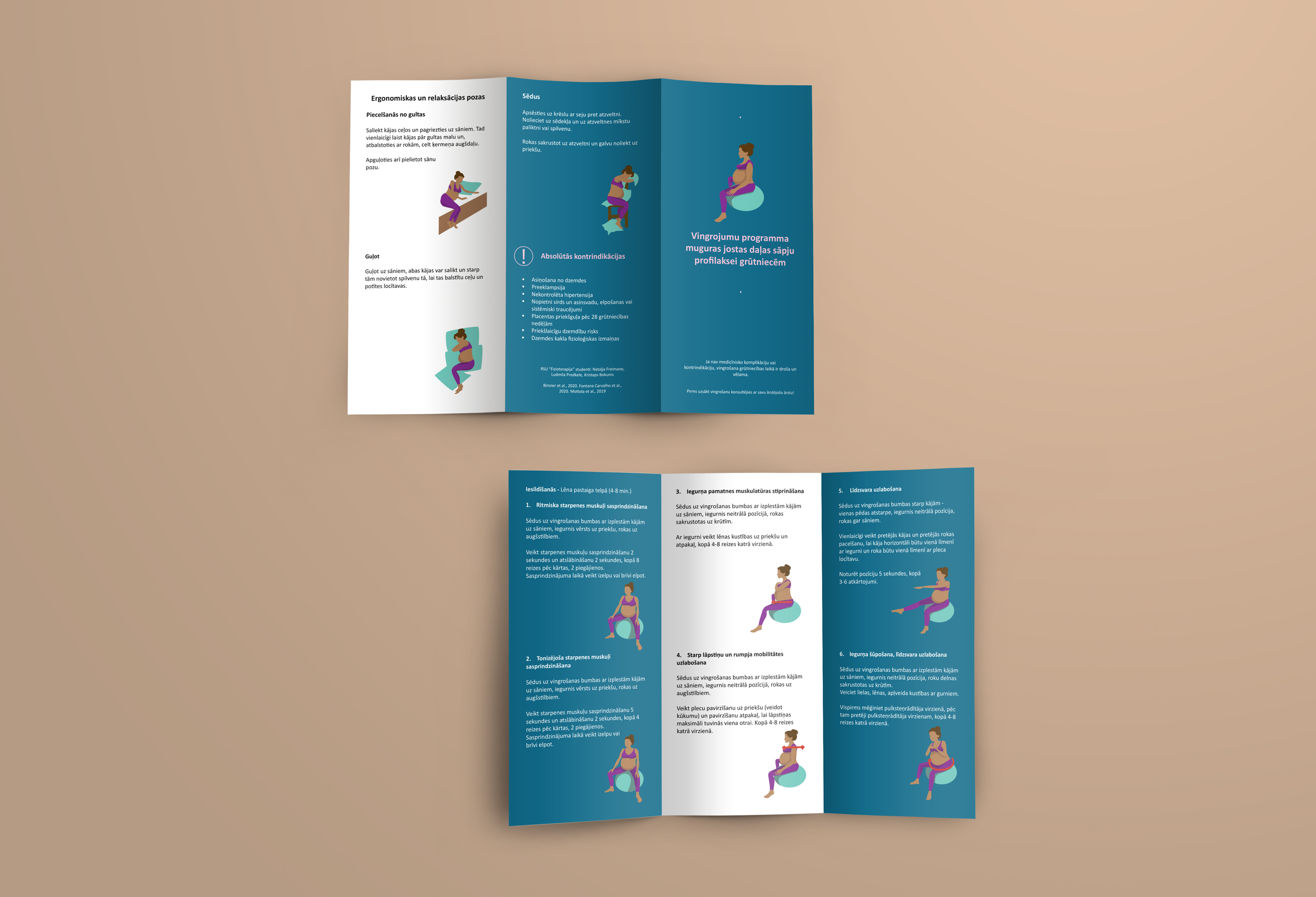
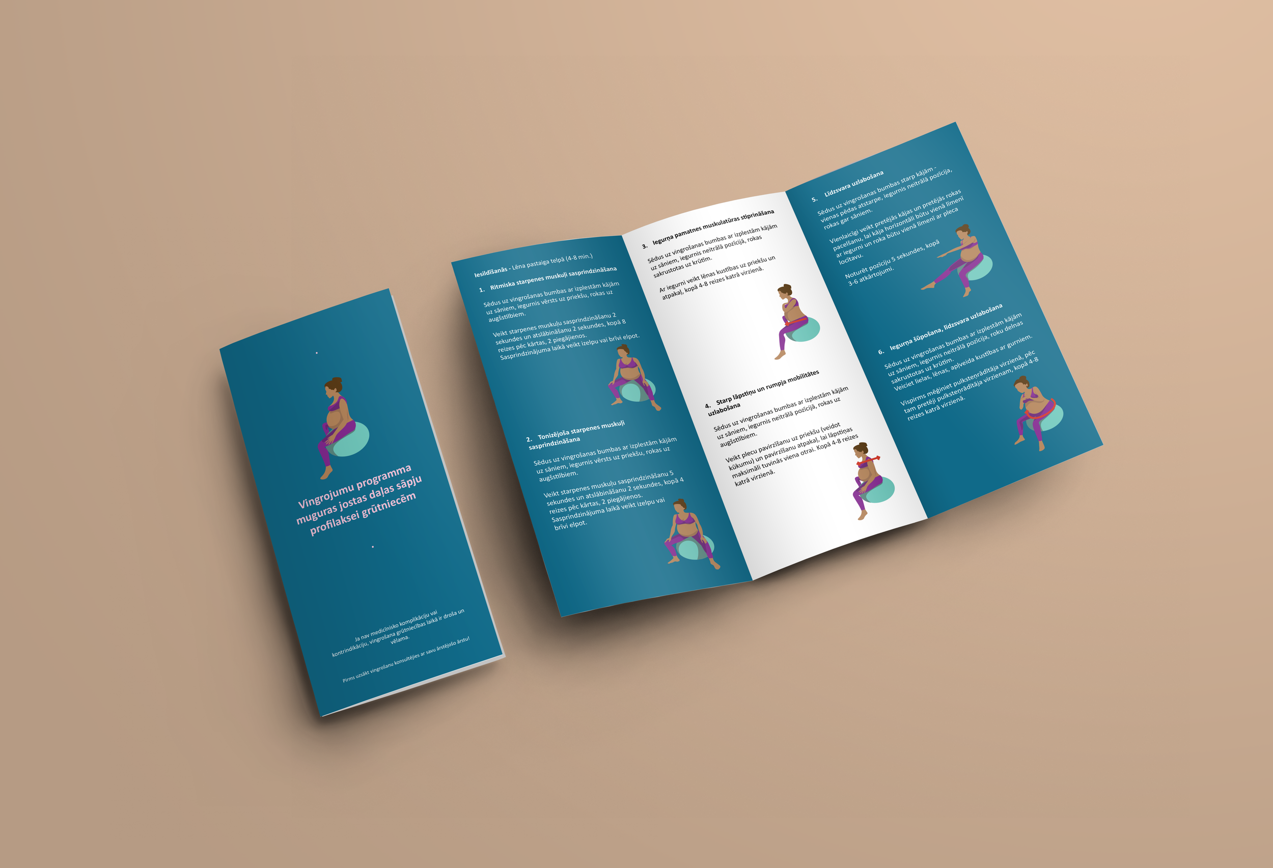
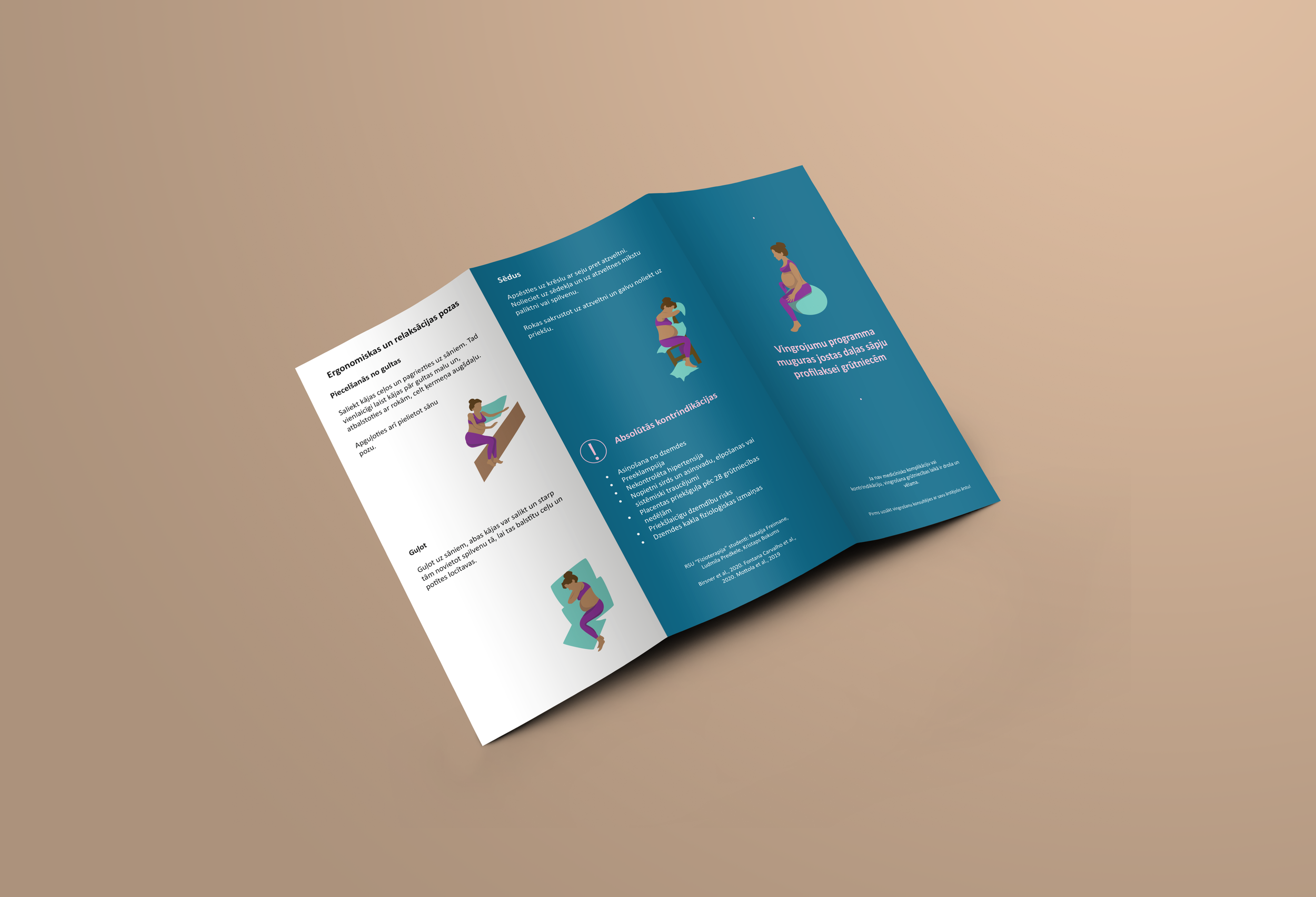
For the color scheme, I proposed ocean blue, white, turquoise, and purple, which was quickly approved. Each color was chosen with purpose:
White symbolizes hygiene, purity, and cleanliness.
Ocean blue (a mix of blue and green) represents calmness, peace, and healing.
Turquoise and purple provided soft, soothing accents.
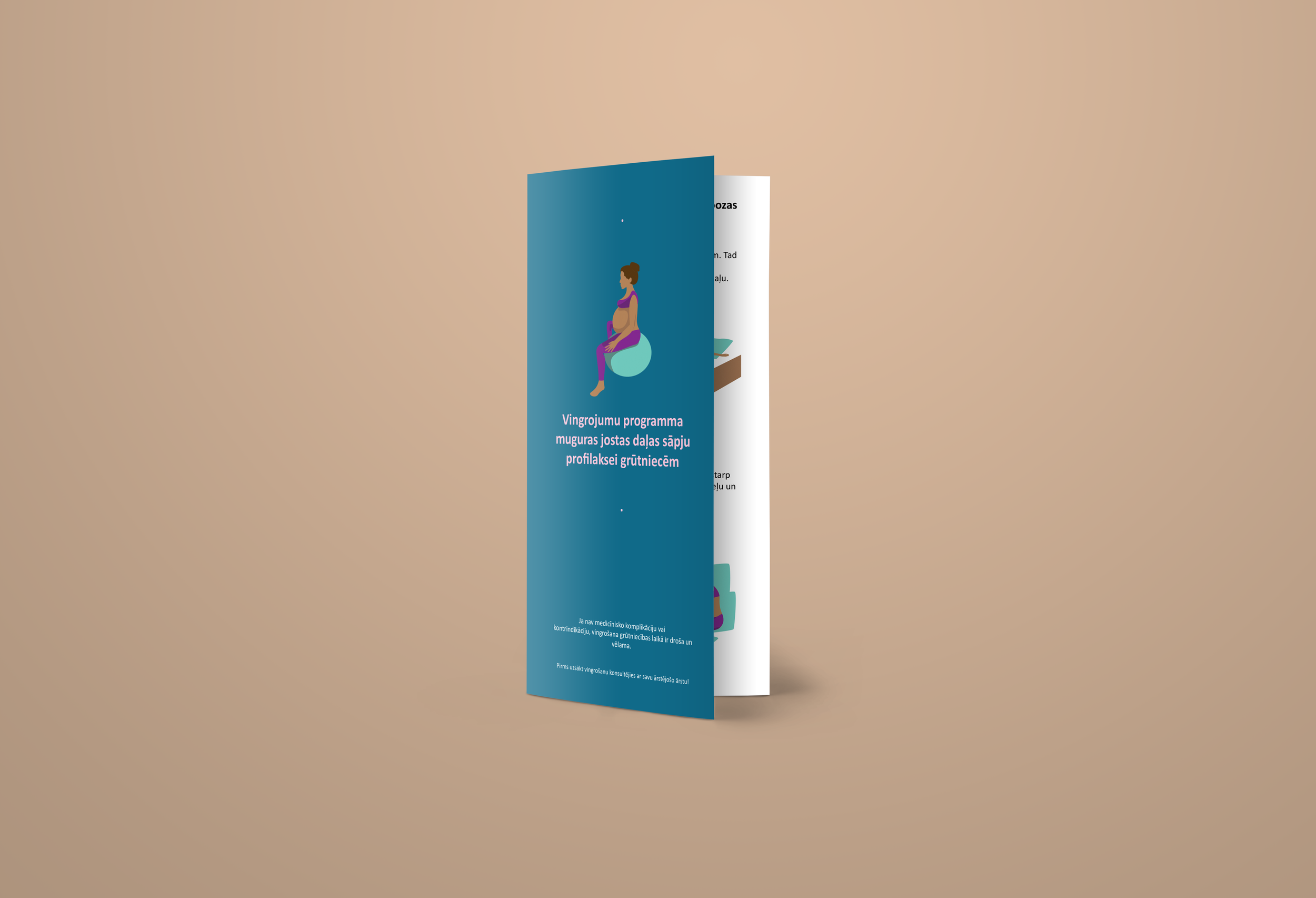
Balancing illustrations and text while ensuring clarity was a challenge, as the brochure needed to highlight key information effectively. I worked on optimizing negative space to maintain readability and focus. Additionally, creating accurate anatomy in vector format was crucial, as the illustrations needed to clearly demonstrate correct movement for pregnant individuals. This required careful attention to body proportions and positioning to ensure the exercises were properly conveyed.
After a few refinements, the final brochure was approved and successfully graded as part of the client’s university project.
Client Review:
"I had a leaflet created with pregnancy exercises, and the order was completed quickly and efficiently. The designer truly captured the main idea of the project, delivering exactly what I needed. The whole process was smooth, and I’m very satisfied with the outcome. Highly recommend for any design work!"
Natalja